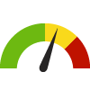
Indicator Gauge Icon Legend
Legend Colors
Red is bad, green is good, blue is not statistically different/neutral.
Compared to Distribution
 the value is in the best half of communities.
 the value is in the 2nd worst quarter of communities.
 the value is in the worst quarter of communities.
Compared to Target
 meets target;
  does not meet target.
Compared to a Single Value
 lower than the comparison value;
 higher than the comparison value;
 not statistically different from comparison value.
Trend

 non-significant change over time;
 significant change over time;
  no change over time.
Compared to Prior Value
 higher than the previous measurement period;
 lower than the previous measurement period;
 no statistically different change from previous measurement period.
 Significantly better than the overall value
 Significantly worse than the overall value
 No significant difference with the overall value
 No data on significance available
Age-Adjusted Death Rate due to Obstructive Heart Disease
This indicator is archived and is no longer being updated. Click to learn more
Why is this important?

| County | Source | Measurement Period | Deaths per 100,000 population | |
|---|---|---|---|---|
Data Source
- Georgia Department of Public Health OASIS
Maintained By: Conduent Healthy Communities Institute (Methodology)
Filed under: Health / Heart Disease & Stroke, Health / Mortality Data, Health Outcomes